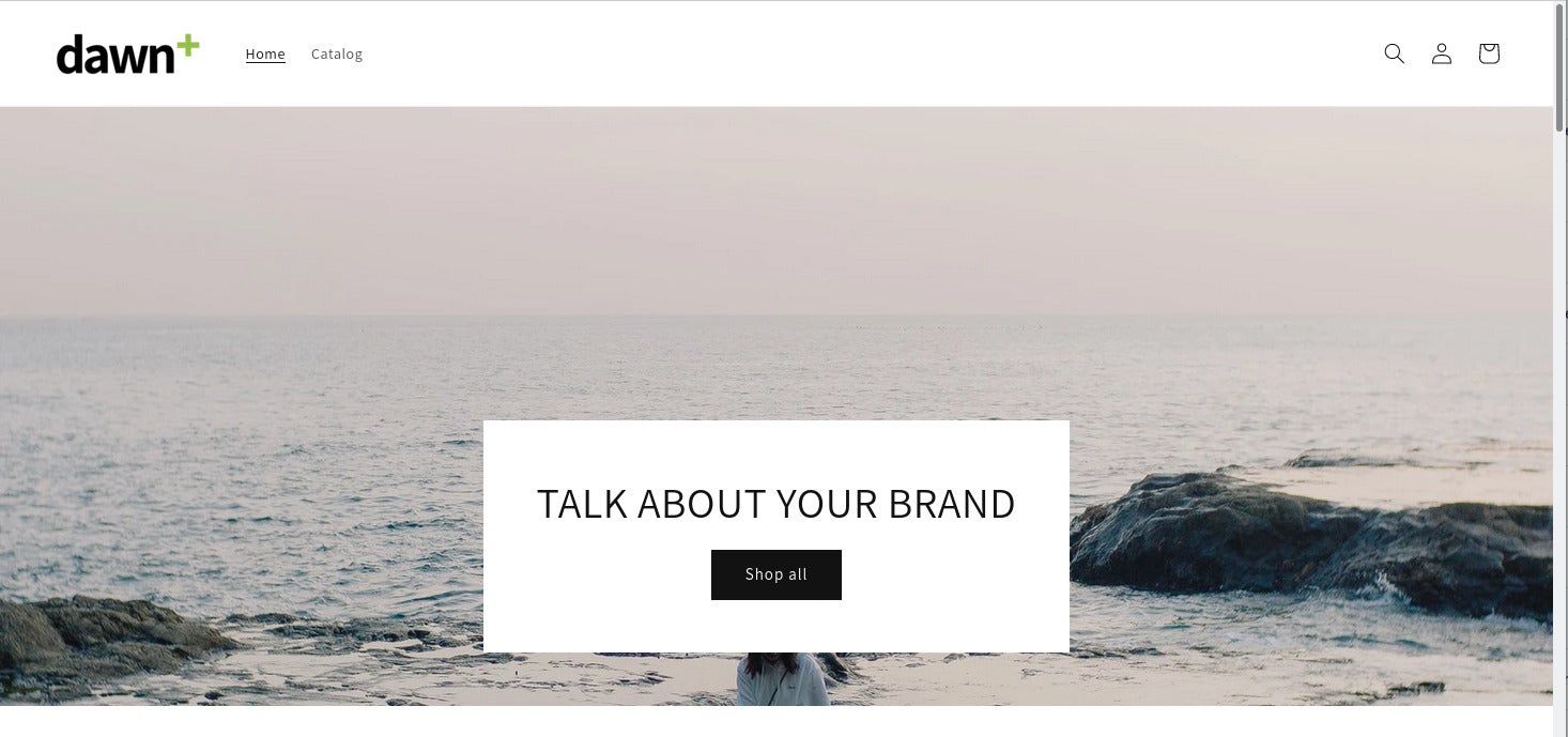
Sometimes you want something a little bit fancier than what a theme offers out of the box. For example, you might find Dawn's solid-color header a bit bland and want it to instead transparently overlap an underlying image. Let's find out how we can give Dawn a little more stylish-looking header.
One of the most popular choices in the previous generation of Shopify themes was Brooklyn. A favorite feature among merchants and what makes it stand out visually is the transparent header that overlaps the hero image or slideshow. Provided you use images that ensure the overlaid navigation menu text is still readable, this can make for a very stylish look indeed.
Dawn doesn't have this feature. The header bar that contains the logo, navigation menu, icons for search, cart, etc. has a solid background. Works well enough, but it can be a bit too "vanilla" for some merchants.
One thing Dawn does have and Brooklyn doesn't is a "sticky" header: If you scroll down the page, the header scrolls out of sight. But if you have the sticky header enabled in theme settings, the header pops in from the top when you scroll back up the page. It's a pretty cool feature that doesn't just look cool: It lets users access the navigation without having to scroll all the way to the top.
Nevertheless, some merchants miss the transparent header from Brooklyn and want to have the same feature in Dawn. Fortunately, it's possible to make Dawn's header work and look like the one in Brooklyn. Check out the before and after screenshots. Not too bad, eh?
Before

After

So let's see what we need to do to get this working in Dawn.
Before You Begin
Before you make any changes to your store's theme, make sure you know how to use the code editor and create a backup of the theme.
Our Goal
First of all we want to make sure that this feature only applies on the homepage, as that's where we'll typically have a hero image or slider which the the header will overlap. On the sub-pages like product detail page, collection pages, etc. there usually won't be a hero image so the transparent header wouldn't make sense there. Of course it would be perfectly possible to make the header work the same on all pages, or only if a hero image is present. But that would be a lot more complex and we want to keep it simple for this tutorial. And after all that's also how Brooklyn worked.
When the header is transparent and overlapping the hero image on the homepage, we need to make sure the sticky effect is disabled, even if it's enabled in the theme settings. This is necessary because if the header is transparent, it would look messy if it popped up in the middle of the page when we scroll back up. The effect of the transparent header only really works on top of a hero image. So we'll add some logic to the code that when the header is transparent, it isn't sticky, but we'll only apply that on the homepage. So the header will always remain non-transparent on all pages except the homepage.
We also want to make it convenient to turn this feature on and off without changing the theme code. So we're going to add a checkbox in theme settings that will let us enable and disable the effect.
Instructions
Let's first lay some groundwork and create the translation strings. It's good practice to not hard-code text strings but to put them in locale files where they can be easily translated.
Locale strings
Open Dawn in the code editor and open the file locales/en.default.schema.json. To quickly find the spot where we'll add our text strings, search for enable_sticky_header. You should find some JSON code that looks like this:

Now add a comma after the }, then insert a new line and paste the following code:
The code should then look like this:

Then save the file.
Schema code
Next we're going to add the code for the theme setting to enable and disable the transparent header. Open the file sections/header.liquid and scroll all the way to the bottom. You should see some code that looks like this:

Add a comma after the }, insert a new line and then paste the following code:
The code should then look like this:

Save the file.
CSS styles
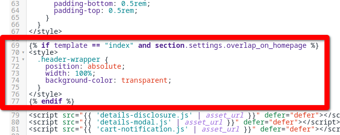
Now we're going to conditionally overwrite the header's styles if the transparent header setting is enabled. In sections/header.liquid add the following code at around line 69 of the file (after the closing </style> tag:
The code should then look like this:

Save the file.
Liquid code for the header
In the final step we have to modify the actual HTML code for the header depending on whether the transparent header is enabled and if we're on the homepage or not.
Around line 92 you should see the following code:

Replace that entire line with this code:
Then scroll down to around line 522 and you should see the code for the closing tag that looks like this:

Again, replace that entire line with this code:
Save the file.
Conclusion
And we're done! With this one change Dawn has gotten one step closer to being as cool and stylish as Brooklyn.
Have other things you like about Brooklyn or other themes that you'd like to see in Dawn? Let me know in the comments!

